top of page


PUBLICIS GROUPE
-
AGENCY:
LEO NYC
ROLE:
CONCEPT
ART DIRECTION
DESIGN
YEAR: 2025
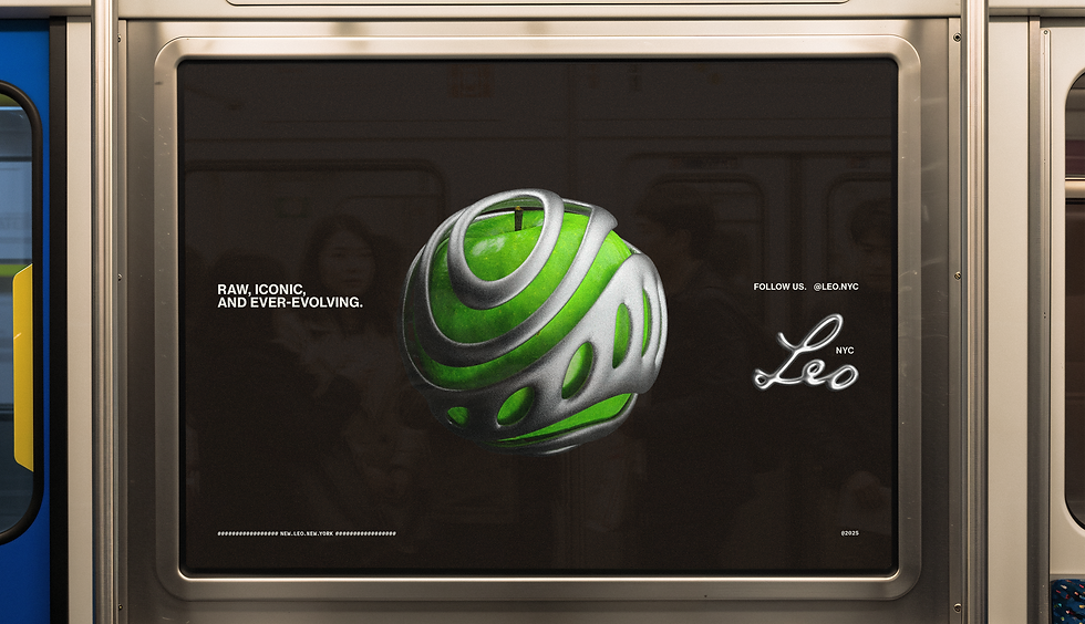
This isn’t just a new office. It’s LEO designed for New York. Raw, iconic, and ever evolving.
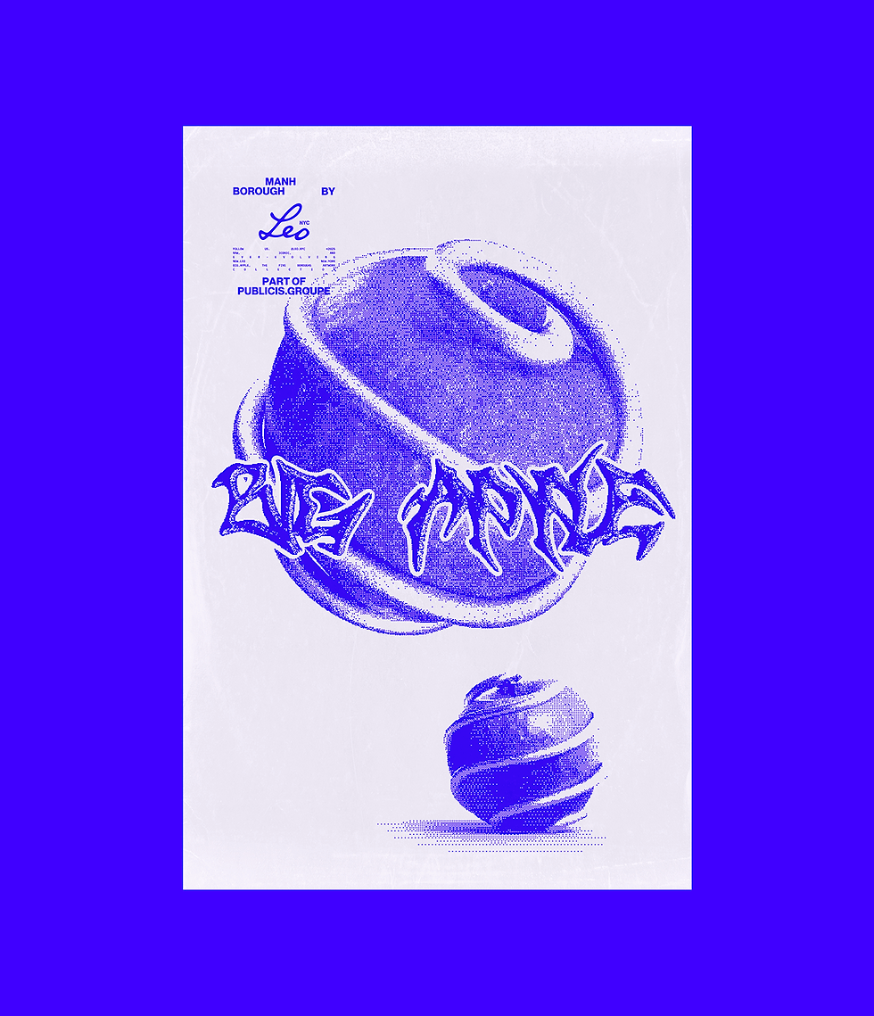
We created a heroic version inspired by NYC. The green apple nods to Leo’s roots, turning it into a symbol of our office’s identity and creativity. Hot Blue, metallic textures, and Leo Black and Green shape the personality of the space.
But this isn’t about a rebrand.
The goal was to build a gallery of assets that expands on the existing branding and makes it feel like ours. Inside the agency, it can spark excitement and a sense of belonging. Outside, it connects the main branding to the look and feel of every piece of communication we produce.
VIC.TOR FERREIRA
CREATIVE ART DIRECTOR
& DESIGNER
UPDATING...
SELECTED WORKS
© 2025
TGSS
GET IN TOUCH
+1 773 412 0173
bottom of page